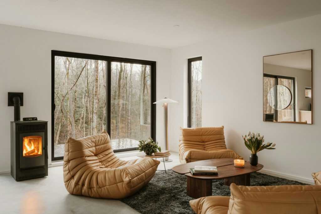
Breaking the Rules: Why Bold Color Pairings Work Now
For years, beige, greige, and soft white dominated design. They were safe, easy, unobtrusive. But 2024 is cutting through the safe zone and color is back with a spine. Designers and homeowners are ditching symmetry and subtlety in favor of fearless palettes that speak louder.
This isn’t chaos for the sake of it. People want spaces that express who they are, not just what’s trendy. Color has emotional weight. A cobalt blue ceiling can energize. A rusty orange sofa can ground. Moody lilacs and vibrant chartreuse throwbacks? They’re pushing feelings to the surface whether that’s nostalgia, confidence, or edge.
The biggest shift? What used to be called “clashing” is now part of the design strategy. Intentional contrast draws the eye and holds attention. Burnt tones with icy pastels, mustard with teal, navy sprinkled with blush it’s not about matching, it’s about balancing tension. In a world overloaded with visual noise, bold color isn’t a risk. It’s a signal.
Designer Approved Combos Worth Trying
Color theory purists might wince, but 2024 is all about bold duos that shouldn’t work but somehow do. If your space feels like it’s missing personality, these pairings deliver kick without chaos.
Burnt orange + dusty lavender brings tension in the best way. The orange grounds the palette with warmth, while the lavender lifts it with a dreamy, unexpected edge. It’s earthy meets ethereal think sunset over desert sand.
Mustard yellow + cool teal hits a retro vibe without falling into nostalgia fatigue. Sharp contrast with a clear midcentury nod, but modernized with crisp finishes and clean lines.
Forest green + blush pink balances opposites. One’s deep and classic, the other’s soft and urban cozy. Together, they blur traditional gender tones and work equally well in living rooms or bedrooms.
Navy + terra cotta is unapologetically rich. Dark, steady blue adds weight, while burnt clay injects life. Perfect in kitchens or home offices where you want both focus and warmth.
Then there’s the wild card: pastels used in high contrast ways. Pale mint slammed against charcoal, or lilac paired with rust. Rule breaking that feels fresh, especially when kept tight and purposeful.
For even more offbeat but solid ideas, check out Explore more unexpected color ideas.
How to Make It Work in Real Spaces

Here’s the trick to pulling off bold color pairings without making your space feel like a theme park: start with neutrals. Cream, sand, soft gray, even matte black the right neutral tones act like a visual pause button. They ground twisty palettes like teal and mustard or lavender and orange, creating room to breathe and making the colors pop without overwhelming the eye.
Once the base is set, bold colors need thoughtful scaling. That doesn’t mean flooding a room in hot pink. It’s smarter to go modular: an accent wall, an ochre velvet chair, or even vibrant bed linens can do more than drenching a space. Textiles rugs, throws, cushions are your low commitment, high impact allies. They let you experiment without total overhaul.
And then there’s texture. Rough hewn woods, matte ceramics, brushed metals they elevate contrast without needing more color. A forest green couch means more when it’s framed by raw oak shelves or set against a chalky terracotta wall. It’s not just paint choice; it’s the full sensory mix of how the materials speak to each other. That’s the balance that makes unusual pairings sing, not scream.
Where These Pairings Are Showing Up Big
Bold color pairings aren’t just for mood boards anymore they’ve moved into the real spaces that need them most. Kitchens are a top target. Designers are ditching all white everything in favor of burnt orange cabinets paired with soft gray tile, or navy lowers with pale pink zellige. It adds personality without screaming.
Powder rooms have become the secret lab for fearless design. Think mustard walls with matte black ceilings or teal tile paired with terra cotta sconces. Because these spaces are small and separate, they’re perfect for taking risks that still feel contained.
In minimalist living rooms, soft furnishings are doing the heavy lifting. A blush sofa with forest green throw pillows, a pale lavender area rug against dark walnut floors these choices bring warmth and texture to otherwise spare rooms.
Accent lighting and color zoning are especially clever in smaller homes and apartments. Designers are using yellow lighting to define kitchen nooks inside open plans, or painting corner reading spots in unexpected pastel hues that break up white walls without overwhelming the space.
Looking for more real life color inspiration?
Parting Notes on Color Confidence
Think in Layers, Not One Offs
Bold color choices work best when they’re part of a broader visual strategy. Instead of relying on a single standout color, layer your palette through various elements like textiles, trims, paint, and furniture. This adds depth and cohesion to even the most unexpected pairings.
Use color variations in different textures: velvet, leather, matte painted surfaces
Introduce supporting shades for balance think tonal gradations
Distribute your color palette across the room: walls, rugs, cushions, artwork
The Color Wheel Is a Guide Not Gospel
Traditional color theory has its place, but today’s design world celebrates experimentation. Opposites may attract, but sometimes so do neighbors on the spectrum. What matters most is how the colors feel when combined.
Complementary? Great. But don’t fear adjacent tones or surprise pairings
Let mood and function drive your color decisions
Take cues from nature, fashion, or even food color inspiration can come from anywhere
Let Your Personal Taste Lead
Trends offer direction, but they shouldn’t override your instincts. At the end of the day, the best color combinations are the ones that make your space feel like you.
Choose colors that spark joy or calm depending on the room’s purpose
Don’t overthink the rules trust your eye
Remember: confidence in your choices is what makes them work


 Ask Linda Rossindals how they got into interior design trends and you'll probably get a longer answer than you expected. The short version: Linda started doing it, got genuinely hooked, and at some point realized they had accumulated enough hard-won knowledge that it would be a waste not to share it. So they started writing.
What makes Linda worth reading is that they skips the obvious stuff. Nobody needs another surface-level take on Interior Design Trends, Essential Gardening Tips, Outdoor Living Solutions. What readers actually want is the nuance — the part that only becomes clear after you've made a few mistakes and figured out why. That's the territory Linda operates in. The writing is direct, occasionally blunt, and always built around what's actually true rather than what sounds good in an article. They has little patience for filler, which means they's pieces tend to be denser with real information than the average post on the same subject.
Linda doesn't write to impress anyone. They writes because they has things to say that they genuinely thinks people should hear. That motivation — basic as it sounds — produces something noticeably different from content written for clicks or word count. Readers pick up on it. The comments on Linda's work tend to reflect that.
