Why Cohesive Color Matters
Color continuity doesn’t just make your home look good it makes it feel right. When color flows naturally from room to room, it calms the eye and reduces visual noise. That quiet coherence adds a subtle sense of order, even if your style leans casual or eclectic. Our brains like patterns, and consistent use of color helps spaces feel connected and intuitive.
There’s psychology underneath all of it. A disjointed color story abrupt jumps from cool tones to warm ones, or clashing accents can create a kind of low level tension. You might not know why a room feels off, but you’ll feel it. On the flip side, well coordinated palettes can make even small homes feel more expansive and open. That’s because flow lets the eye travel freely, uninterrupted.
A few common mistakes? Using bold accent walls without echoing the color elsewhere. Mixing undertones (like pairing warm beige with a steely gray) that don’t harmonize. Or going too all in on trends that fight the home’s existing architecture and finishings. A cohesive scheme doesn’t mean everything has to match but everything should speak the same visual language.
Start With a Core Palette
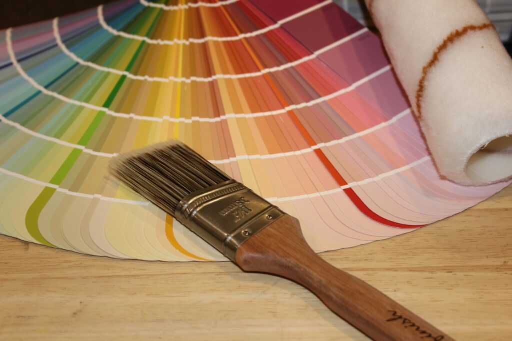
Before you dive into swatches, take a hard look at your space. What kind of light comes in during the day? Is it warm and golden or cool and shadowed? Foundational colors behave differently depending on lighting, so rule number one: test your picks in real conditions. You’re aiming for 3 to 5 base colors that do their job quietly think workhorse tones, not scene stealers.
Neutrals are the backbone of most palettes, but they’re harder to get right than people think. A gray with a blue undertone in one room can lean green in another. Choose undertones with intention, and keep them consistent don’t mix a warm white with a cool charcoal unless you’re pulling that tension deliberately.
Once your core colors are set, everything else becomes easier. That palette guides furniture choices, accent colors, even your textiles and finishes. It’s the map and if you get it right, the journey through your house just makes sense.
Use the 60 30 10 Rule Across Rooms
Color flow isn’t about painting every wall the same shade of greige. It’s about consistency with just enough variation to keep things interesting. That’s where the 60 30 10 rule comes in. It’s a simple formula: 60% dominant color, 30% secondary, and 10% accent. Apply this in each room, and you’ll get balance without monotony.
Here’s how to make it work across your space:
Use your dominant color the 60% as a thread that ties rooms together. It might show up in wall color in one room and upholstery or flooring in another. The secondary color rotates in as support, whether it’s cabinetry, rugs, or drapes. Accent colors are the wildcards: pillows, art, a lamp base just enough to catch the eye and keep things fresh.
Want texture without chaos? Keep your color palette steady but use varied finishes. Matte, gloss, woven, brushed these bring depth without straying from your scheme. A navy can feel moody in a velvet chair but clean and sharp in a lacquered cabinet. Same color, different vibe.
The trick is contrast with control. You’re not repeating the same look; you’re remixing it. That’s how you stay consistent without being boring.
Transition Techniques That Work

Creating a home that feels connected from room to room takes more than just choosing your favorite paint colors. The secret lies in how you transition between spaces, especially in open layouts and in between areas. Thoughtful transitions help maintain the visual rhythm of your home and avoid that “patchwork” effect.
Defining Spaces in Open Floor Plans
In open concept living areas, color continuity is key but you still want to define different zones. Here’s how to keep things cohesive while giving each area its own identity:
Rugs: Use area rugs to visually anchor spaces like dining or seating zones, while keeping the color within your core palette.
Trim and Molding: Consistent trim color can carry the eye through open areas, uniting the layout.
Ceiling Color: A subtle way to maintain continuity keeping ceilings the same color (or just a shade different) ties rooms together.
Smoothing Color Jumps in Doorways and Hallways
Even if one room transitions into a bold accent color, the change doesn’t need to be jarring. Thoughtful connectors make all the difference:
Paint Transitions: Use lighter hallway or transition area colors to buffer stronger hues.
Consistent Flooring or Trim: Uniform flooring or repeated trim color helps lead the eye through different spaces.
Door Frames or Archways: Painting these a neutral or shared trim color softens contrasts between rooms.
Color Bridges That Subtly Align Spaces
Sometimes, small touches are all you need to keep color flow intact. These understated, intentional connections make rooms feel more curated and collected:
Artwork: Choose pieces that reflect accent colors or undertones from adjacent rooms.
Textiles: Curtains, pillows, or throw blankets can echo colors from surrounding spaces.
Lighting Fixtures: Lampshades, pendant finishes, or colored glass can repeat hues without going overboard.
Small shifts, strategic repeats, and consistency in the details help your whole home feel like one connected vision without sacrificing personality or depth.
Adapt Without Sacrificing Flow
Creating cohesion doesn’t mean every room has to look the same. The key is learning how to adapt your colors within a unified palette while allowing each space to express its own purpose and personality.
Use Variations Within the Same Color Family
One of the easiest ways to maintain harmony is to stick with the same color family while introducing variation in shade and tone. This adds depth and visual interest without breaking the flow.
Soften bolder colors in quiet spaces like bedrooms or studies.
Use deeper or more saturated tones in high energy areas such as kitchens or dining rooms.
Mix matte and glossy finishes to add dimension while staying in the same color lane.
Tailor Color to a Room’s Function and Feel
Each room serves a different purpose and your color choices should enhance how those rooms are experienced.
In workspaces: Choose hues that support focus, like muted blues or warm taupes.
In social spaces: Invite energy with richer or brighter tones that encourage conversation.
In restful zones: Stick to calming, cool neutrals or gentle pastels.
Let the function guide how bold or subdued the color expression should be.
Add Bold or Trendy Colors the Smart Way
Design trends come and go, but your color flow should have staying power. You don’t need to avoid bold hues you just need to use them strategically.
Introduce trendy or saturated colors through accents like pillows, art, or area rugs.
Use bold paint on one wall (like in a powder room or small reading nook) while keeping the larger palette consistent.
Repeat that bold color in subtle ways in other rooms think painted trim, accessories, or textiles to tie it all together.
By keeping your dominant palette consistent, you’ll be able to experiment with current trends without undermining the overall harmony of your home.
Style & Color Go Hand in Hand
A cohesive color palette isn’t just about making your home look pulled together. It’s about reinforcing the story your space is trying to tell. Whether you lean vintage, modern, farmhouse, or something more eclectic, your palette should reflect that style not fight against it.
If your design identity favors mid century modern, for instance, stick with earthy tones, clean lines, and strategic pops of saturated color. For a coastal inspired home, keep things light, airy, and washed out. Pairing your palette with a timeless decor style gives your design longevity and saves you from chasing fleeting trends every year.
Done right, cohesive color actually lifts your design style. It makes your space feel sorted, intentional. Vintage pieces feel curated, not cluttered. Contemporary rooms stay sharp without getting sterile. Even bold or quirky items land better when the colors around them support the vibe. In the end, your palette becomes the quiet backbone of a home that feels like it belongs room to room.
Sample Color Schemes That Work
Finding a tried and true color scheme can help eliminate decision fatigue and give your home a sophisticated, well planned look. Below are three versatile palettes, each with a different aesthetic yet all are adaptable for a cohesive, whole home design.
Earth Tone Flow Through
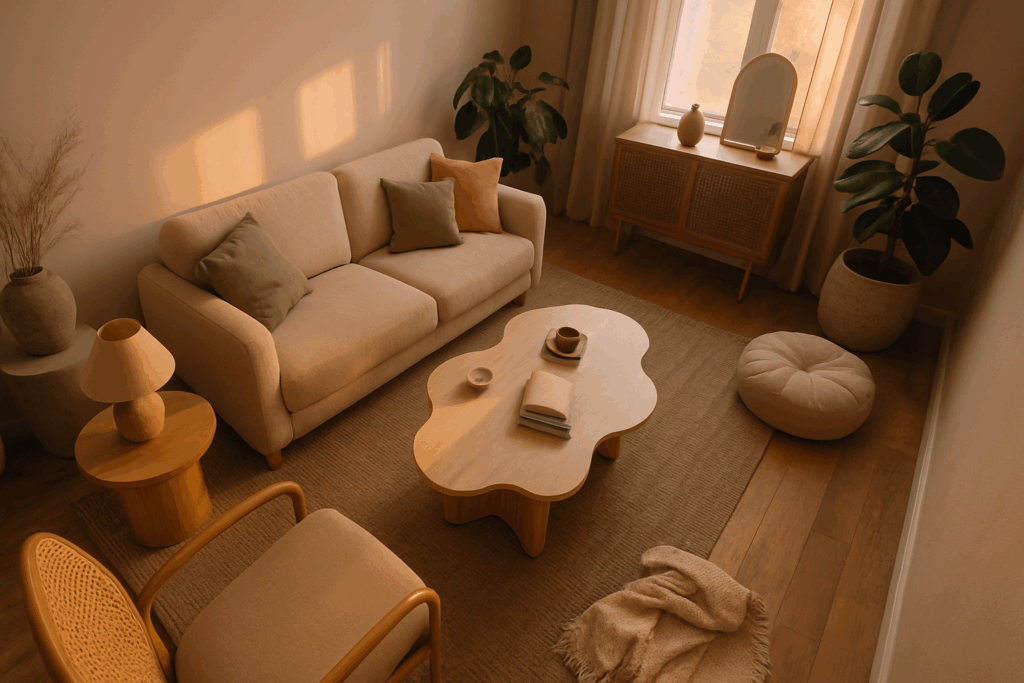
A grounded, welcoming palette that draws from nature’s own neutrals. Earth tones are timeless and flexible, ideal for creating visual warmth and consistency.
Main colors: Terracotta, olive green, beige, camel, and soft white
Best for: Homes with rustic, boho, or transitional decor styles
How to use: Let warmer neutrals carry through open spaces and add depth with deeper shades in private rooms. Incorporate natural materials like wood and leather to enhance the palette.
Coastal Calm
Inspired by breezy beach landscapes, this palette blends soft blues and sea inspired tones with airy neutrals.
Main colors: Soft blue, sandy beige, warm white, driftwood gray
Best for: Light filled interiors, especially in coastal, farmhouse, or contemporary settings
How to use: Keep a consistent white or beige as the base, and vary your blue shades from space to space. Use linen or seagrass textures to tie everything together.
Moody Modern
A bold, yet elegant spectrum with high contrast and saturated accents. Moody modern schemes offer drama without losing sophistication.
Main colors: Charcoal gray, ivory, emerald green, navy, deep plum
Best for: Urban, modern, or eclectic homes seeking visual impact
How to use: Balance dark walls and furnishings with lighter trims and textiles. Jewel tones work well as accents via art, pillows, or statement pieces.
Each of these palettes provides a strong foundation you can build on and adapt room by room without sacrificing cohesive flow.
Key Takeaways for Flow Forward Color
When designing a home with seamless color transitions, it’s the small, intentional choices that make the biggest visual impact. Use the following guide to ensure your color scheme flows smoothly from room to room.
Stay Consistent with Undertones
Even if your colors differ from room to room, they should share the same undertone whether warm, cool, or neutral. Inconsistencies in undertone can unintentionally clash, creating a jarring experience.
Choose warm or cool based colors based on your home’s lighting
Test paint swatches side by side in natural and artificial light
Align undertones across neutrals like beige, gray, and white to maintain flow
Thoughtful Repetition, Not Rigidity
Repetition brings cohesion but rigid replication can feel forced. Instead, echo colors in subtle, creative ways across spaces.
Use your dominant living room color as an accent in the hallway
Repeat tones through accessories like throw pillows, art, or floral arrangements
Allow each room to have its own personality while nodding to an overarching palette
Align with Your Decor Style
Your color palette should complement the style of your space, whether it’s classic, eclectic, or ultra modern. This alignment will ensure your home feels intentional and curated.
Pair warm neutrals with vintage or rustic styles
Use high contrasts and clean tones for modern aesthetics
Blend layered textures and soft tones in bohemian or transitional designs
Explore Timeless Style Inspiration
Choosing timeless colors helps your home stay fresh and relevant long term. For ideas that will outlast trends, explore design styles rooted in enduring appeal.
Soft earth tones for organic, grounded spaces
Crisp black and white for minimalist or modern classics
Muted blues, grays, and linen white for coastal or cottage chic
Need more ideas? Check out this guide to timeless decor styles to spark inspiration for a palette that endures.
Creating consistency across rooms doesn’t mean uniformity it means finding the perfect balance between repetition, variation, and style integration for a polished, whole home look.