Patios tend to follow one of two trajectories.
Either they get better with use, becoming the part of the home that everybody gravitates toward; or They quietly underdeliver: pleasant enough, but never quite the space you imagined when you planned them.
The difference, more often than not, comes down to surface decisions made early in the process.
A patio floor is the foundation of every design decision that follows. It sets the visual register for furniture, lighting, and landscaping. It determines how the space feels underfoot, how it reads in different light, and whether it still looks considered after a few seasons of sun, rain, and regular use.
Getting it right is not a small thing.
The tips below are organized around the decisions that actually move the outcome: how to think about scale and layout, how material character shapes atmosphere, and how handcrafted surfaces deliver something that factory-produced tiles cannot.
Throughout, the focus is on spaces designed to be used and enjoyed, not just photographed.
Start with how the space will actually be used
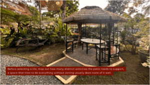
The most useful thing you can do before looking at a single tile is to write down, concretely, what this space needs to do. Morning coffee for two. Weekend dinners for eight. Afternoon reading. A cooking area. Children playing. These are not interchangeable briefs, and a patio designed without distinguishing between them tends to compromise on all of them.
This is particularly relevant for designing multi-use patio spaces for all-year enjoyment, where the goal is to create a space that earns its place in every season rather than serving one use case well and sitting empty the rest of the time.
Zoning is the practical answer to this: distinct areas defined by surface level, material choice, or planting, each designed for a specific activity rather than a vague general-purpose function.
Surface selection follows directly from use.
- A dining zone benefits from a tile with a relatively smooth, easy-to-clean finish.
- A lounging area can carry more texture and visual complexity.
- A transition from indoors to outdoors works best with a material that reads as intentional in both contexts, not jarring in either.
Once you know how the space divides, tile selection becomes a series of much more focused decisions rather than one overwhelming one.
Why handcrafted tile changes what a patio can feel like
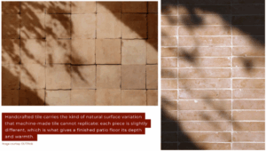
The case for handcrafted outdoor tile is not primarily aesthetic, though the aesthetic argument is strong. It is about what the surface does to a space over time.
Machine-made tiles are uniform by design: consistent color, consistent texture, consistent finish across every piece.
That uniformity is the point in many applications, but in an outdoor space designed to feel warm, personal, and connected to the landscape, it tends to read as flat.
Luxury outdoor patio tiles from OUTERclé are handcrafted surfaces where natural variation in color, texture, and glaze is intrinsic to the material. No two tiles are identical, which means the finished floor has the kind of depth and character that uniform tile cannot produce.
● Cement tiles
Cement tiles, for instance, carry their color through the full depth of the wear layer, using mineral pigments fired into the body rather than applied to the surface. The result is a tile where wear reveals more of the same material rather than an inferior substrate.
● Terracotta tiles
Terracotta tiles develop a natural patina over time, integrating with the garden environment rather than remaining static.
● Terrazzo tiles
Terrazzo carries aggregate character through the entire thickness of the tile, so it reads as genuinely substantial rather than decorative.
This is what separates surface character from surface decoration.
A well-specified handcrafted tile does not look better on day one and progressively worse thereafter. It looks right on day one and continues to improve as it settles into space.
Choosing a tile that works with your outdoor palette
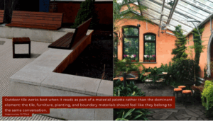
Outdoor material palettes work differently from interior ones. Inside, you control light, temperature, and backdrop. Outside, the tile has to hold up against shifting daylight, the green of the garden, the sky, and whatever sits adjacent: timber furniture, stone planters, rendered walls, or a pool edge. The tile is not the only surface in the picture. It has to work as part of a conversation.
- Warm earthen tones, including terracotta, ochre, warm grey, and sand, tend to read naturally in garden settings because they reference the palette of the landscape itself. They warm up in afternoon sun rather than bleaching out, and they age in a way that feels intentional.
- Cooler tones, including blue-grey, slate, and charcoal, work well in more structured, formal settings or where the surrounding architecture has a clean, contemporary character.
Pattern and format scale matter more outdoors than many people anticipate. A small-format tile in a large open patio can feel busy and visually fragmented. A large-format tile in a small courtyard can feel imposing.
The general principle is that the tile format should feel proportionate to the zone it covers: larger tiles for open ground-level areas, smaller formats for defined zones, features, or areas with more enclosed boundaries.
Texture is the third variable.
A heavily textured surface captures shadow and gives the tile visual depth at a distance. A smoother surface reads more cleanly and is easier to maintain.
For outdoor entertaining spaces, where spills and dirt are part of the picture, a surface with enough texture to have character but smooth enough to clean with a hose is usually the most practical balance.
Making a small or awkward patio work harder
Not every outdoor space starts with a generous footprint. A lot of the most interesting patios are compact, irregular in shape, or both. Transforming small outdoor spaces into stylish retreats is largely a surface design problem: how you lay the tile, at what scale, and in what orientation has as much influence on the perceived size of the space as the furniture or planting choices.
A diagonal tile layout draws the eye across the longest dimension of a space rather than along its shortest edge, which makes rectangular patios feel wider and more generously proportioned.
A modular format, mixing two or three tile sizes in a structured pattern, gives a small space visual complexity that makes it feel more designed and less constrained.
Running bond, where tiles are offset by half their length, is a simple detail that breaks up the rigidity of a grid layout and makes the surface read as more relaxed.
Grout color is a detail that significantly affects how busy or calm a tiled surface looks. A grout that closely matches the tile body reads as a unified surface where individual tiles are less distinct. A contrasting grout emphasizes the grid and gives the pattern more presence. In smaller spaces, a more closely matched grout tends to make the surface feel calmer and the space feel less visually cluttered.
For irregularly shaped patios, the layout should be planned from the centre of the most prominent zone outward, rather than from an edge. This ensures that the most visible area of the floor has full tiles at its centre, with any cut tiles pushed to the perimeter where furniture or planting will often conceal them.
Skipping this step is one of the most common reasons a patio tile installation looks slightly wrong without anyone being able to articulate why.
Practical things to know before you specify and install
A few practical points that are worth knowing before committing to a specification.
- View samples outdoors, not indoors. Tiles can look very different in natural light, especially warm earthen tones. Check samples in the actual space in both morning and afternoon light before finalising.
- Slip resistance still matters. Even covered patios get wet from rain, irrigation, condensation, or spills. Matte and textured finishes usually perform better outdoors than high-gloss surfaces.
- Know the sealing requirements. Cement, terracotta, and natural stone all need sealing before installation and at intervals afterward. Make sure you understand the maintenance schedule before you buy.
- Check freeze-thaw suitability. If your climate drops below zero regularly, confirm the tile has a tested freeze-thaw rating. Not all outdoor-rated tiles are made for frost-prone conditions.
- Order extra tile. A good rule is to order about 10% more than the measured area to cover cuts, waste, and batch consistency.
- Use the right adhesive. Exterior installations need a flexible, exterior-rated adhesive that can handle thermal cycling.
- Plan movement joints properly. They should be placed at regular intervals and at all changes in plane. This is one of the most overlooked details and one of the biggest causes of outdoor tile failure.
- Ask about batch consistency. This matters especially with handcrafted tile. Ordering everything from the same production batch helps avoid visible variation later.
The patio is the room that rewards the most considered decisions
An outdoor living space, done well, becomes the room the whole house orbits around in the months when the weather cooperates. It is also the space where surface decisions are most permanently consequential: unlike interior rooms, where a floor or wall finish can be changed relatively easily, a patio tile installation is a long-term commitment.
The good news is that getting it right is not a complicated process.
It requires thinking about use before aesthetics, understanding what different materials actually do over time, and making practical decisions about installation that the finished space will reward for years.
A patio designed around all of those things, surfaced in a material with genuine character and the engineering to back it up, is not just a nice place to sit. It is one of the most satisfying improvements a home can offer.
 Ask Linda Rossindals how they got into interior design trends and you'll probably get a longer answer than you expected. The short version: Linda started doing it, got genuinely hooked, and at some point realized they had accumulated enough hard-won knowledge that it would be a waste not to share it. So they started writing.
What makes Linda worth reading is that they skips the obvious stuff. Nobody needs another surface-level take on Interior Design Trends, Essential Gardening Tips, Outdoor Living Solutions. What readers actually want is the nuance — the part that only becomes clear after you've made a few mistakes and figured out why. That's the territory Linda operates in. The writing is direct, occasionally blunt, and always built around what's actually true rather than what sounds good in an article. They has little patience for filler, which means they's pieces tend to be denser with real information than the average post on the same subject.
Linda doesn't write to impress anyone. They writes because they has things to say that they genuinely thinks people should hear. That motivation — basic as it sounds — produces something noticeably different from content written for clicks or word count. Readers pick up on it. The comments on Linda's work tend to reflect that.
Ask Linda Rossindals how they got into interior design trends and you'll probably get a longer answer than you expected. The short version: Linda started doing it, got genuinely hooked, and at some point realized they had accumulated enough hard-won knowledge that it would be a waste not to share it. So they started writing.
What makes Linda worth reading is that they skips the obvious stuff. Nobody needs another surface-level take on Interior Design Trends, Essential Gardening Tips, Outdoor Living Solutions. What readers actually want is the nuance — the part that only becomes clear after you've made a few mistakes and figured out why. That's the territory Linda operates in. The writing is direct, occasionally blunt, and always built around what's actually true rather than what sounds good in an article. They has little patience for filler, which means they's pieces tend to be denser with real information than the average post on the same subject.
Linda doesn't write to impress anyone. They writes because they has things to say that they genuinely thinks people should hear. That motivation — basic as it sounds — produces something noticeably different from content written for clicks or word count. Readers pick up on it. The comments on Linda's work tend to reflect that.