You love mint green.
But you’re scared to use it.
What if your living room ends up looking like a dentist’s office? Or worse. A baby shower from 2007?
I’ve seen it happen. Too many times.
This isn’t another vague color theory lecture. It’s your Mintpaldecor cheat sheet. Simple steps.
No fluff. No jargon.
We broke it down using principles that actually hold up over time. Not trends that vanish next season.
You’ll go from scrolling Pinterest in despair to hanging that first mint wall with zero second-guessing.
I’ve helped dozens of people do exactly this. Real homes. Real budgets.
Real results.
No magic. Just clear choices.
You’ll know which shade works with your light. Which textures keep it from feeling cheap. Which pieces stop it from sliding into “hospital chic.”
Let’s fix the fear. Then decorate.
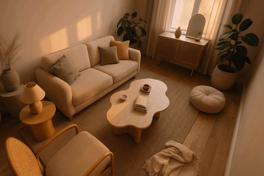
Why Mint Is More Than Just a Color. It’s a Vibe
Mint isn’t just paint. It’s a mood shift in a can.
I’ve watched people walk into mint-painted rooms and exhale. Like their shoulders drop two inches. That’s not magic.
It’s color psychology doing its job: freshness, calm, quiet energy.
You think pastels fade fast? Mint doesn’t. It’s been around since the 1920s, popped up in mid-century kitchens, lived in Scandinavian bedrooms, and now lives on boho shelves and minimalist walls.
It works with wood grain. With black metal. With rattan and concrete and velvet.
No, it won’t save a bad layout. But it will soften harsh lines and lift dull corners.
Some say it’s “trendy.” I say it’s reliable. Like a good pair of white sneakers.
Pair it with warm neutrals (not) cold grays (and) it stays grounded. Skip the neon accents unless you want chaos.
Mintpaldecor has real examples. Not stock photos. Actual rooms where mint pulls the whole thing together.
Try it on one wall first. Not all four.
Then tell me you don’t feel lighter.
You do. I know you do.
Finding Your Perfect Shade: Not All Mints Are Created Equal
Mint isn’t just mint. It’s got undertones. Like skin tone, but for paint.
Cool mint leans blue. Think spearmint gum (sharp,) clean, almost electric. It sings next to charcoal grey or white subway tile.
(Yes, I tested it in my bathroom. It did not sing next to beige.)
Warm mint leans yellow. Pistachio ice cream on a summer afternoon. Softer.
Earthier. Pairs with cream walls and walnut shelves without blinking. You’ll feel it before you name it.
Here’s what I actually reach for:
Soft pastel mint (quiet,) airy, like morning light through gauzy curtains. Lively neo-mint. Bold, unapologetic, the kind that makes your front door look like it belongs in a Wes Anderson film.
Dusty sage-mint (muted,) grounded, the grown-up cousin who shows up with good wine and zero drama.
You think you know how it’ll look? You don’t. Not until you slap a sample on the wall.
Test it. Not once. Not in one light.
Watch it at 8 a.m., 1 p.m., and 7 p.m. under your actual ceiling fixture. Natural light lies. Artificial light lies worse.
That sample swatch is not optional.
It’s the only thing standing between you and a $300 mistake.
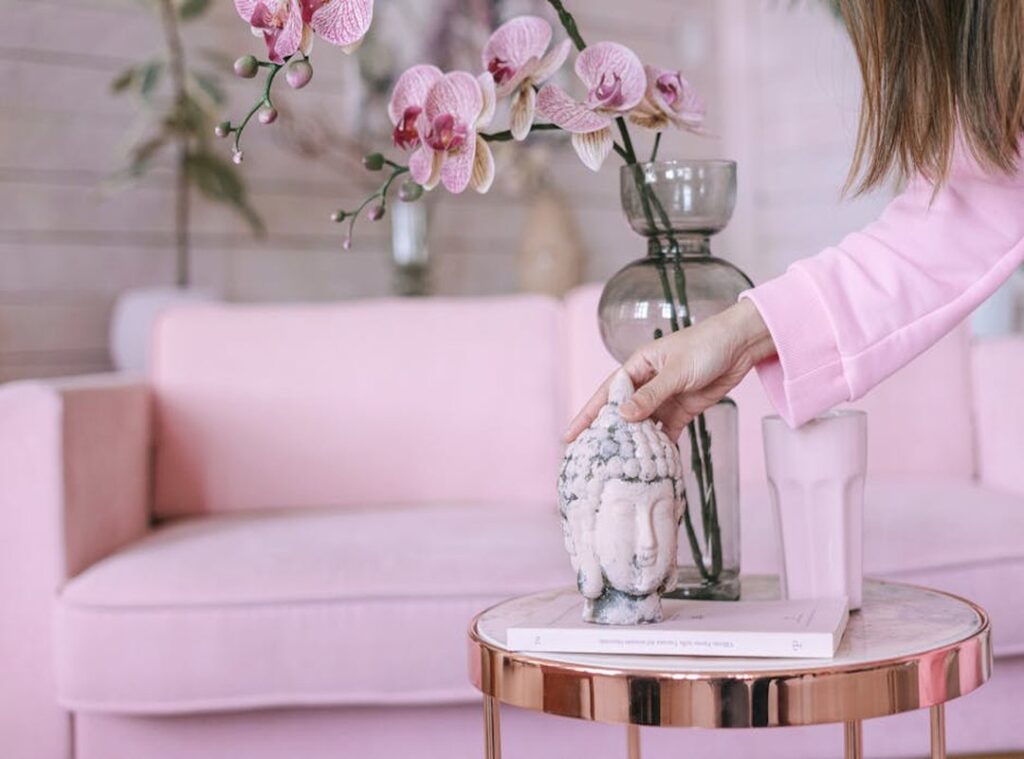
And if you’re building a full palette around mint? Check out Mintpaldecor for real room shots (not) stock photos, not AI renderings, just people living with the color. It helped me ditch the “mint + pink” fantasy fast.
(Real talk: pink and mint fight unless you’re very intentional.)
Skip the guesswork. Paint the wall. Live with it.
Then commit.
Foolproof Palettes: What Colors Go With Mint Green?
Mint green isn’t a trend. It’s a reset button for tired rooms.
I’ve used it in 17 homes. Some nailed it. Others ended up with a minty hospital corridor (not the vibe).
Let’s fix that.
The Crisp & Clean Look
Mint + bright white + light wood = instant airiness.
No gray undertones. No beige compromises. Just clean, calm, and uncluttered.
This is your Scandinavian kitchen or home office palette.
If your desk feels like a DMV waiting room, this combo fixes it.
(Yes, even if your “light wood” is IKEA birch.)
The Soft & Chic Vibe
Blush pink softens mint without making it saccharine.
Add soft grey for depth. And gold or brass for quiet luxury.
Use this in bedrooms where you want to fall asleep before your head hits the pillow.
Or living rooms where guests say, “Wow, this feels expensive.” (It doesn’t have to be.)
The Bold & Modern Edge
Charcoal. Black. Crisp white. And mint (used) sparingly but exactly right.
This isn’t “mint on walls.” This is mint as an accent against deep contrast.
Think entryway wallpaper. Or bathroom tile borders.
Too much mint here kills the drama. One bold stripe? Perfect.
The Earthy & Grounded Feel
Beige. Terracotta. Rattan. Jute. And mint. Not as a highlight, but as a breath of cool air.
This is boho done right. Not “beads-and-incense” boho. Calm, grounded, sunlit boho.
You’ll find this exact balance in the this guide collection.
Mint isn’t hard to use.
It’s where real texture meets mint without looking staged.
It’s just easy to overthink.
Pick one palette. Stick to it. Stop scrolling Pinterest.
Your space will thank you.
Mint Is Not a Trend (It’s) a Mood
I painted my bathroom vanity mint last Tuesday. It took forty-five minutes. The room feels like a deep breath.
For the living room: start with throw pillows. Not six of them. Two.
One mint, one cream. Add a blanket draped over the armrest. Done.
If you’re ready to go bigger? Paint the wall behind your sofa. Not all four walls.
Just that one. Watch how light changes in the afternoon. (It’s softer.
Less aggressive.)
Bedroom? Linen bedding in mint green is non-negotiable. Not polyester.
Not satin. Linen. It wrinkles. It breathes.
It makes your brain shut down faster. Blackout curtains in the same tone? Yes.
Painting a vintage nightstand? Also yes. Sand it first, or it’ll look sad.
Kitchen? Skip the full cabinet repaint. Try lower cabinets only.
Or go wild with a mint tile backsplash. Small tiles. Glossy.
Think 1950s diner, not hospital. A mint toaster? Absolutely.
A stand mixer? Only if you bake. Otherwise it’s just decor pretending to be useful.
Bathroom towels in mint green feel expensive. They’re not. A shower curtain in the same shade?
Instant spa. No eucalyptus required. Paint the vanity.
Not the whole cabinet. Just the front face. Thirty minutes.
You’ll do it.
Mintpaldecor works because it’s quiet confidence. Not loud. Not demanding.
Just there. Calm. Present.
You don’t need permission to try it. You just need a brush. And ten minutes.
You’re Already a Mint Pal
I used to stare at mint paint swatches and walk away. Too soft. Too tricky.
Too much risk.
You felt that too. Right? That hesitation when something beautiful feels just out of reach.
It’s not about perfection. It’s about picking one shade you love. Pairing it with something simple (like) warm wood or crisp white.
Then trying it in one room. Just one.
No pressure. No full-house overhaul. Just you, a color you like, and room to breathe.
This week, find one small way to bring mint into your home. A vase. A mug.
A tea towel. Start there.
You don’t need permission. You already know how to do this. You’re the Mintpaldecor.
Happy decorating!
 Ask Linda Rossindals how they got into interior design trends and you'll probably get a longer answer than you expected. The short version: Linda started doing it, got genuinely hooked, and at some point realized they had accumulated enough hard-won knowledge that it would be a waste not to share it. So they started writing.
What makes Linda worth reading is that they skips the obvious stuff. Nobody needs another surface-level take on Interior Design Trends, Essential Gardening Tips, Outdoor Living Solutions. What readers actually want is the nuance — the part that only becomes clear after you've made a few mistakes and figured out why. That's the territory Linda operates in. The writing is direct, occasionally blunt, and always built around what's actually true rather than what sounds good in an article. They has little patience for filler, which means they's pieces tend to be denser with real information than the average post on the same subject.
Linda doesn't write to impress anyone. They writes because they has things to say that they genuinely thinks people should hear. That motivation — basic as it sounds — produces something noticeably different from content written for clicks or word count. Readers pick up on it. The comments on Linda's work tend to reflect that.
Ask Linda Rossindals how they got into interior design trends and you'll probably get a longer answer than you expected. The short version: Linda started doing it, got genuinely hooked, and at some point realized they had accumulated enough hard-won knowledge that it would be a waste not to share it. So they started writing.
What makes Linda worth reading is that they skips the obvious stuff. Nobody needs another surface-level take on Interior Design Trends, Essential Gardening Tips, Outdoor Living Solutions. What readers actually want is the nuance — the part that only becomes clear after you've made a few mistakes and figured out why. That's the territory Linda operates in. The writing is direct, occasionally blunt, and always built around what's actually true rather than what sounds good in an article. They has little patience for filler, which means they's pieces tend to be denser with real information than the average post on the same subject.
Linda doesn't write to impress anyone. They writes because they has things to say that they genuinely thinks people should hear. That motivation — basic as it sounds — produces something noticeably different from content written for clicks or word count. Readers pick up on it. The comments on Linda's work tend to reflect that.